Friday, October 11, 2019

Add a Shopping Cart to Your Website


If your business already has a website and you're ready to sell products online, you may worry about needing to start your website over from scratch. This can be discouraging — after all, you've probably already spent a lot of time and effort on your website. Or maybe you paid a professional designer to build your site for you, and full redesign just isn't in your budget. Either way, your customers are already used to a certain look and feel for your website, and you may not want to unexpectedly change that!

Fortunately, it's easy to add shopping cart to a website without changing your existing design, even if you're not experienced with the technical aspects of website creation. In fact, there are several ways you can accomplish this.
You can add an online store catalog that works alongside your website and connect it to your main website with very little editing to your original site. Or, if you're comfortable working with HTML code, you can add products directly to any page of your website as you see fit.
This article will explain how.

What is a shopping cart?

An online shopping cart is software that provides the necessary features for customers to make a retail purchase from your website. Some shopping cart software is quite simplistic and only adds the bare essentials, like products and a checkout page. Other shopping cart software goes the extra mile and includes features for you to provide your customers with an improved shopping experience. The best shopping cart software comes with other eCommerce tools for running your business.
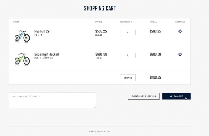
Shopping Cart Visibility

Parts of shopping cart software

Much like a cash register in a brick-and-mortar store, shopping cart software comprises the customer-facing side and the employee- or business-facing side.

The customer-facing component is often called the frontend or the storefront and consists of the online store that customers browse. The administration side is usually called the backend, the admin, the dashboard, or the control panel. Together, the frontend and the backend of the software work to allow customers to place orders and you to process those orders.

As mentioned, very basic shopping cart software provides a method to purchase products and make payments. Advanced shopping cart software can include additional features like:
  • A virtual cart that allows customers to select multiple products at once before checkout
  • A "View Cart" page for reviewing the selected items
  • Individual pages for each product, complete with pictures and an easy-to-navigate layout for product information
  • Categories and subcategories to organize products and make it easier for customers to find them
  • Search functionality to help customers find products instantly
  • Extra product page information, like product reviews and a customer Q&A
  • Extra pages for displaying store policies and business information
  • A built-in blog feature for posting news, updates, and other valuable content (essential if your current website doesn't already include a blog)

An advanced shopping cart's backend can include features such as:

  • Order management and sales reporting
  • Inventory control with stock quantity alerts
  • Shipping integrations, e.g. real-time rate calculations and label printing
  • A Customer Relationship Manager (CRM) for logging all interactions with customers
  • Marketing tools, such as email newsletters
  • A large selection of integrated payment gateways
  • Sales tax calculation
  • Social media integration for exporting/synchronizing products to a Facebook Shop
  • Other marketplace integrations, e.g. Amazon and eBay
  • Integrations to connect the shopping cart with your preferred business software, such as QuickBooks
As you can see from these examples, the more advanced shopping cart software goes far beyond the simple "checkout" functionality and becomes more like a centralized software-based hub for running your entire business. When a shopping cart contains these extra business features, it's often called an eCommerce platform rather than simply a shopping cart, although many people use these terms interchangeably.

Types of shopping cart software

Some shopping cart software must be downloaded and then installed on your own web server. This often requires purchasing a license, which usually entitles you to software updates and support for a limited time (often one year).

Other downloadable shopping cart software is open-source, which means the software itself is free. However, this doesn't negate the costs of web hosting — and free, open-source shopping cart software has another serious downside. Its open-source nature means the software can be edited by an entire community of developers, so users often struggle to get knowledgeable support. To truly make the best of an open-source eCommerce platform, your business would need a developer to keep it all running smoothly.

Hosted shopping cart software is the best solution for a small business, and for any business seeking to add a shopping cart to an existing website. Hosted shopping carts are a complete package that includes web hosting with the eCommerce software already installed. With a hosted solution, you don't need to download and install anything — instead, you simply log into your control panel with your web browser. The shopping cart software provider handles software updates and other technical aspects of the platform. Instead of paying for web hosting and/or a software license, you pay a monthly or annual fee for one of the plans offered by the provider. This is referred to as the Software-as-a-Service (SaaS) model.

Shopping cart software can also be differentiated by its programming language. Online shopping carts can be written in Java, JavaScript, ASP, and other languages, but an HTML shopping cart is the most versatile. HTML shopping carts are compatible with all browsers and devices, including desktop and mobile — a necessity for selling online today. Cookies are required for HTML shopping carts, but customers can be notified quickly that they need to enable cookies in order to shop on your online store. Today, eCommerce is so popular that the knowledge of cookies is commonplace, so this almost never presents an obstacle to your customers.

Read Original Article At https://www.3dcart.com/

Thursday, October 10, 2019

Beautiful eCommerce Store Design Inspiration for You Business

Designing a blog, or a personal website is one thing. You still need to worry about general design aspects, usability and website functionality, but not as much as you would when it comes to designing an eCommerce website.

An eCommerce Store Design needs to resemble a real physical store. That means everything should flow naturally; everything should be accessible and easy to navigate. Over the course of the last couple of years, creating a spectacular eCommerce store has become less of a problem. Here at Colorlib, we have covered eCommerce extensively: best eCommerce themes for WooCommerce users, and a free collection of the best eCommerce themes for WordPress that have been built with Bootstrap. Furthermore, there is a selection of eCommerce PSD templates to give you the freedom to code your own design from scratch, using a pre-inspired design.

Although very important by itself, only having great quality product photos isn’t going to do the full trick. You need to make sure that customers browsing your store are able to refine and explore their options for productions through a seamless form submission, much like a digital catalog. Design your store so that the search bar is never hidden and is always clearly presented; people love to search for things they get new ideas for. You should also always mention the availability of items; checking out and getting an ‘out of stock’ message can be very frustrating for some.

Ask yourself what is the reason behind doing it, and what benefit it will bring to the design. Don’t forget to incorporate good practices of search engine optimization. We could go on for hours, but instead, today, we will outline some of the most inspirational, well-designed, and appealing web designs from popular eCommerce stores.

Mahabis

Mahabis originates from London, a famous world location for fashion, and modern clothing design. Londoners love to express themselves through their physical appearances, and it’s brands like Mahabis that keep this movement alive. The values of Mahabis are beauty, simplicity, and functionality. 80% of world’s operating countries have customers for Mahabis clothing catalog; and the website that they operate from plays a big role in that achievement. Their flagship products is comfortable and modern slippers that are being manufactured in countries like Portugal. The features of the store allow anyone to explore different colors sets, and learn in-depth of what makes these slippers so unique and so admired all over the world.

OBEY Clothing


Obey Clothing – OBEY Clothing

The Obey Clothing line has managed to capture the attention of a large population of millennials, coming out around the time when most were in their early ages. Since the inception of the line, it has grown into this massive movement of creative artists and street art fans that serve the skateboarding and punk-rock scene. OBEY is for those who love to express themselves uniquely and passionately. The Obey online store isn’t a complex design. It’s a minimalistic approach towards putting the product in the eyes of consumer, and concluding a sale effortlessly. The same couldn’t be told about physical OBEY locations, which tend to be more lively and hip. The black on white design here works really well. Lastly, in the checkout page, you have a few selection of sizes and colors; the checkout button is fairly straightforward.


Read Original Post at https://colorlib.com/

BigCommerce Stencil VS Blueprint : Why You Need to Upgrade?


If your eCommerce store is hosted on BigCommerce, you’ve likely heard of Blueprint and Stencil – the two available BigCommerce theme frameworks. Since being introduced in 2015, Stencil cleared the way for a new era of theming that supports a number of benefits for eCommerce businesses.

If you haven't upgraded to BigCommerce Stencil and are still using Blueprint, you could be missing out on many benefits of the updated framework. In this blog, we're covering the key benefits and drawbacks of each framework to help you make an informed decision about what setup works for your business.

Bigcommerce Stencil VS Blueprint

BigCommerce Stencil Vs. Blueprint

Blueprint Downfalls

Here at Groove Commerce, our developers have worked with both Blueprint and Stencil frameworks on a number of websites. Before we present the benefits of Stencil, we want to point out the biggest frustrations that our developers have experienced while using Blueprint.

Limited Editing

First, all development on Blueprint must be to be done within the editor available within the BigCommerce admin account. With the prevailing use of modern development tools and applications, the old, limited BigCommerce Blueprint editor can hinder productivity for developers.

Global Variables

BigCommerce Blueprint can cause many store variables to be blocked and inaccessible to developers. Blueprint hides many of the store attributes inside %%GLOBAL%% variables that do not let developers access and change their contents. As a result, this can lead to major project roadblocks.

No Local Testing

Local testing is also not possible in Blueprint, so any changes that you want to test out must be made live on your eCommerce website. This drawback makes it inconvenient to carry out any conversion rate optimization tests, A/B tests, etc. These tests are essential to maintain the efficiency and UX/UI of your site.

BigCommerce Stencil Benefits

Now that you understand some of the frustrations experienced by front-end developers when dealing with Blueprint, you can better appreciate all the changes BigCommerce made when creating their Stencil framework.

Modern Front-End Development Framework

Stencil has bypassed limited editing capabilities and global variables by implementing handlebar templating language. This grants developers the freedom to make changes as they wish. This framework makes it easier to redesign, develop and change a site with much less coding.

Using CSS preprocessors, developers can write code much faster by writing in abbreviations that are then translated and expanded into full code. This is another functionality supported by the Stencil framework.

CLI to Facilitate Local Testing

Not having the ability to carry out local testing was a huge grievance to developers in the Blueprint framework, making it a focus when creating Stencil.

Stencil allows developers to use a command line interface to facilitate local testing and development that does not affect the live site. It also lets developers test the store theme with the store data within settings. Additionally, Stencil has 160 industry-specific theme variations (compared to Blueprint’s 58), so you’re destined to find a customizable theme that perfectly suits your store.

Another modern functionality in Stencil is the BrowserSync preview. Developers are able to view any changes they have made in real time on any device. This eliminates the possibility of making changes to a desktop view that comes across negatively on mobile or tablet devices.

Cornerstone and New Functionalities

BigCommerce supplies its own base Stencil theme called Cornerstone. It is regularly updated with the latest features and functionalities offered, including Apple Pay and Google AMP (accelerated mobile page) support.

Cornerstone's native AMP compliance ensures faster page speed and great website experiences on a mobile device.

What’s Next?

Whether you are looking for a migration from Blueprint to Stencil or a entire eCommerce platform migration, Groove Commerce can help you facilitate that move. If you have any questions or want to learn more about what an upgrade could look like, feel free to contact us below!

Read Original Article at https://www.groovecommerce.com

Wednesday, October 9, 2019

Best Free Shopify Themes You Should Use in 2019

 
Building a new eCommerce website shouldn't require an advanced developer. Inventors and entrepreneurs typically don't have the know-how to construct an online store from scratch, but they also don't have the capital to pay lots of money for one. That's where eCommerce platforms like Shopify come in. All you have to do is sign up for Shopify, pay the monthly fee, then choose a Free Shopify Themes for your design. Some of the paid themes are as professional as you can get, but the free category has its outliers as well.

With the themes, you can adjust designs and content, while also adding your products. These themes are key to cutting down on the design time, so that's why we want to outline the best free Shopify themes available.

Not only is a free Shopify theme going to keep costs low, but you'll be able to construct a beautiful, modern, and professional site, all without having to pay for a customized design. This could end up saving you anywhere from $500 to $10,000. Considering the average startup doesn't have that type of cash to throw around, a free Shopify theme is the way to go.

Some of the themes are older, but the majority of them have new, drag and drop elements and sections, which provide full content modules (like for product galleries or testimonials,) with the ability to move them around on your homepage. All of the free Shopify themes are completely responsive for mobile shopping, and you get an incredible number of apps to improve the functionality of your Shopify website.

What's great is that the apps all integrate seamlessly with the Shopify themes. So, for instance, an awards program plugin would combine nicely with each of the themes we talk about below.

With that said, keep reading to learn more about the best free Shopify themes on the market. Also, let us know in the comments if you have any preferences.

Read Original Article At https://athemes.com

What Top Sites Are Doing with eCommerce Cart and Checkout Design

You’ve attracted a consumer to your site and won them over on a particular product, but most eCommerce marketers know that doesn’t guarantee a sale. Shopping cart and checkout functionality can make or break a sale. It can also make a big difference to your average order value (AOV), which is why optimization of online your store cart and eCommerce Checkout Design is so important.

Each year we analyze leading eCommerce sites across dozens of categories to identify what features and technology they’re using: which features are trending and becoming the norm. In this post, we detail our research about shopping cart and checkout trends, creating the best checkout pages, and ecommerce shopping cart best practices, complete with examples from many of the websites we studied.
Based on our research on leading eCommerce sites in 2018, here are:
    1. Popular Shopping Cart and Checkout Features
    2. Shopping Cart and Checkout Features that are Trending Down
Note: Want to talk to our CRO team (who performed this study) about how your site compares to the best-in-class? Reach out here or schedule a call above.

Part One: Popular Shopping Cart and Checkout Features

Across the leading eCommerce sites we studied, these six features were extremely common:

Feature #1: Site Keeps a User on the Page When They Add an Item to the Cart

In use on 17 of 20 best-in-class websites
Keeping the user on the product page instead of taking them to a separate cart page is now a dominant trend in 2018.
Our rule-of-thumb is that sites that average more than 1.6 products per order should not send users to the cart each time they add a new product.
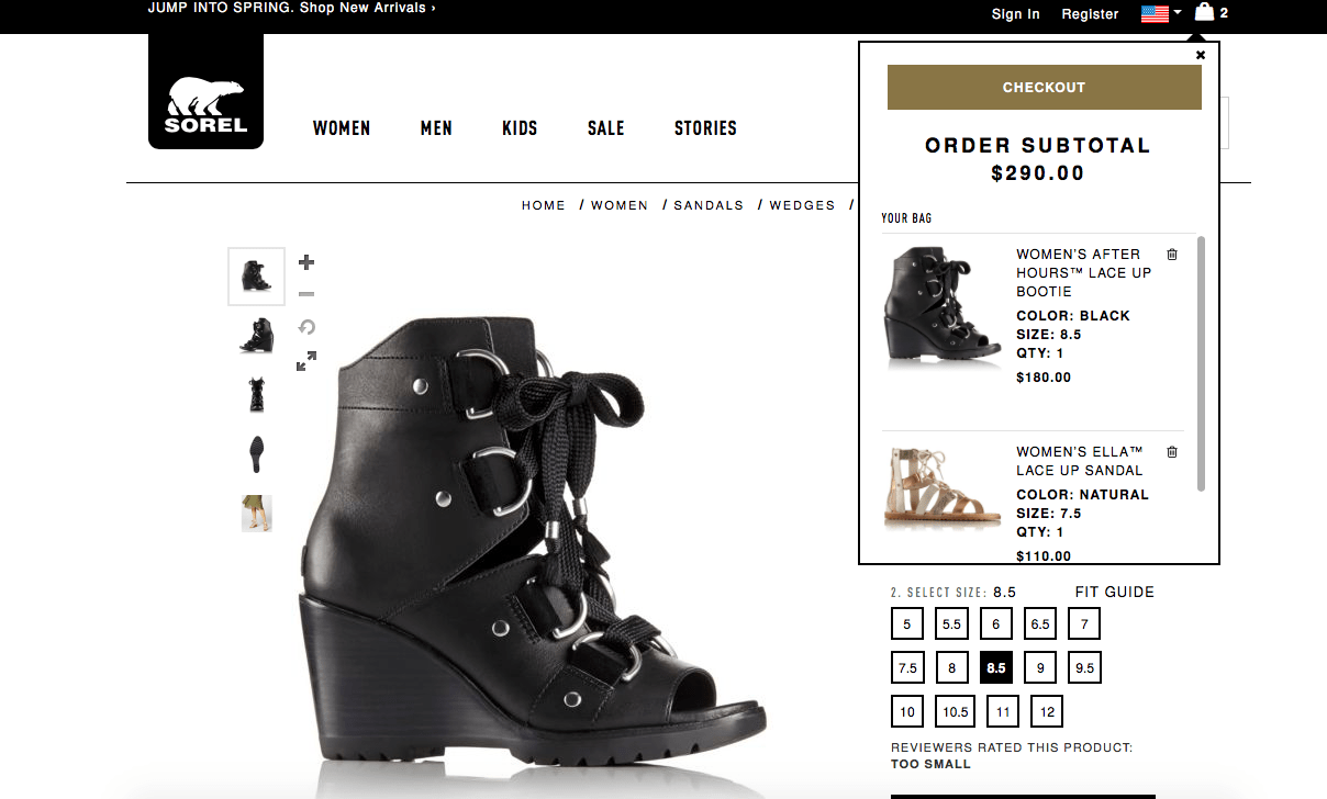
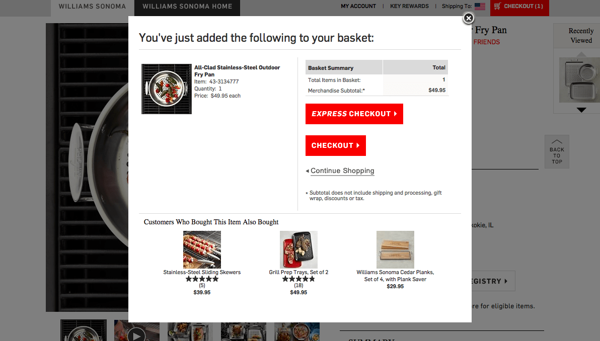
There are two standard styles you’ll see for sites that do this: a drop-down “bag” and a lightbox-style pop-in layer.

13 best-in-class sites use a drop-down “bag”.

ecommerce cart examples 

9 best-in-class sites use a pop-in. We this option trending up and believe it’s because pop-ins allow for easier cross-selling options.

eCommerce cart: Pop-ins allow for easier cross-selling options.

Feature #2: Cart Provides Product Attributes

In use on 18 of 19 best-in-class websites  (1 site not applicable)
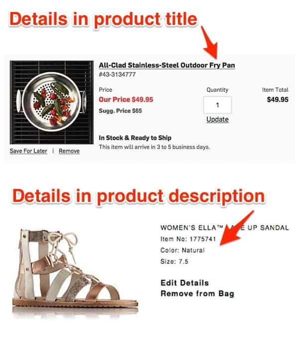
This year, we saw dramatic growth in the number of best-in-class sites that include product attributes (such as fabric, finish or size) in their cart details.
The cart provides details in the product title and product description. 

When you have similar products that may differ on one or more attribute, you need to show the attributes with the product name and picture to assure users that the right item is in their cart.

Feature #3: Cart Contains a “Candy Rack”

In use on 10 of 19 best-in-class websites (1 site not applicable)
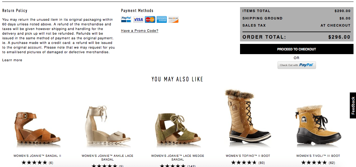
The “candy rack,” or upsell area is growing in popularity. You’ll currently find this in half of the best-in-class sites, and most of the sites that aren’t employing a candy rack simply haven’t found a good way of doing so.
For instance, due to the amount of products they sell, REI or Walmart need a higher level of intelligence to get the right product in front of you, and Nixon or GlassesUSA are unlikely to sell you another watch or frame. Whenever you can get relevant products in front of users, however, this has a high likelihood of increasing AOV. 

The "Candy Rack" is a great way to upsell and give recommendations of other products the consumer may enjoy. 


Read Original Article at https://www.goinflow.com/

Friday, October 4, 2019

The Ways to Give Your Online Store a Facelift

To stay competitive and relevant, retailers need to actively monitor the latest trends in ecommerce software and other offerings that will keep shoppers visiting their websites and making purchases. The eCommerce Marketplace is growing more competitive as consumer interest in online shopping increases around the globe. Tried and true methods for success from past years may now be outdated, but online retailers can make changes to revamp their ecommerce stores and make them more appealing to the modern consumer. Here are a few of the latest trends in online shopping and how online merchants can take advantage of them.
eCommerce Facelift
eCommerce Facelift


It's all about the experience
 
With so many ecommerce websites these days, standing out from the crowd is crucial, and giving users a unique experience can help. Ventureburn reported that the design of a website can make or break a sale, but that takes into account more than just the way it looks. The site should be laid out in a logical way that makes it easy for consumers to browse through your inventory, select items and get to the point of sale. Not only will this interface help improve brand awareness and keep customers coming back for more, but it can bolster sales, as many consumers will be willing to pay more for the option to customize their items.


Add a personal touch to every sale
 
Going online to make a purchase may be almost mindless to some shoppers by now, but The Week suggested a way for ecommerce merchants to mix things up. eCommerce Personalization is one of the major trends of 2014, as more and more retailers are giving their patrons the ability to customize their items. This not only makes the shopping experience more interactive and enjoyable, but it leaves the shopper with a product that was actually designed just for them.


Customers love a little variety
 
Cornering a niche market by selling a select set of items can be successful, but offering an array of products has many advantages as well. Ventureburn pointed to a December 2013 study called the Effective Measure Report, which revealed that nearly half of shoppers would buy more if an online store had more quality products to choose from. This strategy can work no matter what you're selling. Luxury shops that specialize in jewelry, for instance, could expand their offerings to include other accessories that customers buying their main products might also like to purchase.


Read Original Post at https://www.retailpro.com

Thursday, October 3, 2019

Some Of eCommerce Marketing Strategies Your Business Should be Using

Let’s say you’re in the market for a rose gold watch for a woman, be it yourself or someone else. When you search for this on Google, you’ll see everything from rose-tinted stainless steel for $25 to complete rose gold watches studded with chocolate diamonds and a mother of pearl face that costs several thousand.
And you’ll find hundreds of thousands of results—if not more—in between.
There is a ton of competition online for ecommerce businesses, so knowing how to set yourself apart and get your name out there is essential. Your ecommerce marketing strategies should focus on capturing people looking for products and actively using several outbound strategies to get people to want to find you.
There’s a large number of different ecommerce marketing strategies out there, and in this post, we’re going to take a look at 14 of the most essential strategies you can use to set yourself apart and get more sales.
Note, this blog post was updated on May 16, 2019.

Low-Cost Ecommerce Marketing Strategies

Virtually all ecommerce businesses can and should use these low-cost marketing strategies. I consider these tactics to be the building blocks of an eCommerce Marketing Strategy, because even one single action (like updating keywords or just one blog post) can yield return for years to come.

1. Optimize Your Site for Search

Search Engine Optimization (SEO) is still an essential part of marketing and you want to make sure that both your site and all of your individual product pages are fully optimized for the exact keywords your audience is searching for.

Keyword research can help with that. You can check out our full guide on how to conduct thorough keyword research here.
Watch out for dialect differences, too. Are they searching for “timepiece” instead of “watch?” Make sure you’re optimizing for those keywords correctly, even if the general population is searching for them less overall.

2. Include Reviews on Product Pages

I can’t overstate the importance of reviews. 84% of people trust online reviews as much as they trust their friends. That means we either really trust reviews or we all have really bad friends…I’m going to assume it’s the former.


As if that’s not significant enough, 88% of users incorporate reviews into their buying decision. You can’t afford to skip out on reviews.


There are a lot of plugins for WordPress and Shopify apps that make it easy to upload customer reviews (which can include pictures and videos) to your product pages. Yotpo and Pixlee are both excellent services that can help with this.

Read Original Post at https://www.disruptiveadvertising.com

Complete Guides to eCommerce Personalization for Digital Marketers

Despite many consumers wanting and expecting more relevant and personalized experiences, a recent study by Pure360 suggests that most brands are still relying on only basic forms of ecommerce personalization.

According to a Deloitte paper, this is creating a gap between customer expectations and the experiences brands are delivering.

Part of the issue is that personalization is hard. The messages too often spoken about personalization are simplistic or catastrophic. It’s either something dramatic and urgent like, “if you’re not doing one to one personalization, your competitors will zoom past you.” Or it’s too simplistic, like “personalize post-click landing pages with company names.”
These types of messages, however, focus on the tip of the iceberg rather than the process you need to develop to make personalization work. The focus should be on strategy, and how personalization can be a tool used to improve the user experience and lift business metrics.

What is ecommerce personalization?

eCommerce Personalization is the art and science of delivering specific shopping experiences to targeted visitor subgroups to increase conversions and revenue, as well as improve the user experience:

ecommerce personalization example

It’s like any form of personalization. You have to have a few things in place:
  1. An ability to collect data on visitors (behavioral, transactional, demographic, etc.)
  2. An ability to analyze that data to find segments that may respond more favorably than the aggregate pool of visitors to a specific experience
  3. An ability to deliver an experience to that segment in real time
While it’s mostly used, at this point, by eCommerce Marketers, others such as engineers, product managers, customer success professionals, and sales professionals can also use personalization to increase ROI.

Read Original Post at https://instapage.com

Plan Your Social Media Marketing Strategy for Your Online Business

Social media is paramount for e-commerce, its significance has grown to mammoth proportions over the years with its ability to reach specialized pools of consumers.
Brands that relied on traditional forms of advertising to further their base have taken to optimizing their brand to fit into different social media niches on the web. E-commerce brands can target consumer collectives with a range of purchasing capacities through planned social media strategies.

These Social Media Strategies should aid in developing healthy patterns of online engagement:

Wholesome amalgamation of content

When customers sign up to follow different portals on your brand’s social media portfolio, the content on these platforms should not pertain entirely to posts on your brand. This would tire your audience, and deviate your campaign from following a pattern of organic engagement.
Providing external content that induces user sharing, would keep your platforms consumer engagement at optimal levels, furthering user interaction with posts pertaining to your e-commerce venture.
Here are a few user poll statistics that establish positive content-client interaction:
  • 61% followers admitted to buying a product because they found the brands’ content interface engaging.
  • 78% consumers bought the product after being directly influenced by the brands’ social media content.
  • An e-commerce’s social media platform accounted for 1 out of 10 customers directed towards the site.
If the engagement levels on your social media campaigns deteriorate, it will also affect the reach on your new posts since Twitter, Facebook, Pinterest etc, push content based on follower engagement formulae.
brand awareness
To capture the niche space on a user’s feed, e-commerce brands have to constantly engage followers with shareable content in the form of original or recycled articles, listicles, and micro-content. Posting engageable social media content frequently will push an organic stream of consumers to your online store.
However, being at all these (social) places all at once is a challenge. There are many social media publishing software that you can use to schedule posts in advance and have a filled content calendar for each social profile.

Factoring in SEO strategies

Search Engine Optimisation can be improved in leaps and bounds through social media, the higher the quality of follower to brand engagement on a social media platform, the greater the boost to page rating and visibility.
The number of followers does not count as much as their organic interactivity as followers.
In Google’s search ranking, external inbound links play a huge part in generating traffic, but these links should encourage quality engagement to make a significant difference towards optimization.
Additionally, using local listings, hashtags, keywords etc, to make your content easier to search and share can boost your brand’s SEO.

Create a culture of reviews

Social media reviews act like digital crumbs to followers, if the engagement on the review is positive it has the potential to convert a follower into a customer. If your brand sells on many e-commerce portals, encourage customers to leave feedback and reviews on their purchases.

social media management 

Study has it that nearly 70% of customers base their purchasing decision on products that attract the most amount of reviews on e-commerce portals.
Widgets that connect and sync reviews and customer engagement by stringing it, through your social media platforms and e-commerce page can build bulk reviews, often a single portal might attract more reviews and customers who seek out reviews on a different portal featuring your brand might miss out on reading positive customer feedback and choose brands with better reviews on that particular platform.

Does your brand have an online persona?

Expecting a brand to have an online persona might sound far-fetched to most, but the formulas of most successful engagement portals such as BuzzFeed, are often identified by their content creators who have formed a human face to the brand, thus drawing viral engagement towards the platform.
In such a case, the virality of their content does not happen by chance, the entire brand is built around the sole attribute of generating viral engagement with every post.

Originally Published at https://www.floship.com/

Get to Know Your Customers : Tips to Knowing Your Customer

GET TO KNOW YOUR CUSTOMERS DAY

Get to Know Your Customers Day reminds businesses to reach out to patrons and get to know them better. The day is observed annually on the third Thursday of each quarter (January, April, July, October). 
When businesses get to know your customers, you also get to know more about what you need to grow. Remember when Main Street businesses were locally owned and operated? The owners knew you by name and knew your shopping habits. Additionally, they typically knew what you wanted to buy. Not surprisingly, if they didn’t have it, they were willing to get it in for you.
With the advent of the Internet and big-box stores, unfortunately, much of the personal attention has gone by the wayside. Get to Know Your Customers Day is a day to turn that around. Make it a point to get to know a little more about your customers. Most importantly, make each of them feel like they are your most important customer of the day.
Tips to Knowing Your Customer:
  • Ask your customers questions. Find out what services and products they need. 
  • Use social media. Get the word out about your specials and new product. Social media is a great tool to find out what your customers like and don’t like about your store. It’s important to respond as quickly as possible. When you do, it will be noticed. remember, fixing a negative customer experience in a positive way can show you stand by your word. In turn, it could transfer into future multiple sales.
  • Follow up on a purchase. Ask your customers how their purchase or service worked for them. Not only will you find out about your product, but you will learn more about your customer and the services they need.
  • Network with other business. Learning and sharing best practices for getting to know customers from other successful businesses will also grow your business.
HOW TO OBSERVE GET TO KNOW YOUR CUSTOMERS DAY
Grow your business by taking the time to get to know your customers. In doing so, you’ll be planting a seed that will flourish! Use #GetToKnowYourCustomersDay to post on social media.
HISTORY OF GET TO KNOW YOUR CUSTOMERS DAY
We have been unable to find the creator of National Get to Know Your Customers Day.
There are over 1,500 national days. Don’t miss a single one. Celebrate Every Day® with National Day Calendar®!

FUTURE DATES FOR GET TO KNOW YOUR CUSTOMERS DAY


Read Original Post at https://nationaldaycalendar.com

Examples and Tips For Holiday Email Marketing

Are you planning to run contests and giveaways to grab your customers’ attention this holiday season? Wondering how you can stay in touch next year with all the new fans and followers you gain from your Thanksgiving, Black Friday and Christmas promotions?
We have the marketing automation tools that will help!

The engagement you see when you run a holiday contest or giveaway is gratifying…but the connections you make are also very valuable — especially if you’ve managed to collect your contest entrants’ email addresses. We’ve seen users host giveaways that add thousands of people to their email lists in just a few short weeks.
Email addresses are the most valuable resource to come out of a contest or giveaway, and the best way to stay in touch with people so you can turn them into paying customers.
In this post, we’ll look at holiday email marketing ideas, including a series of autoresponders and scheduled emails to send out during the hours, days and weeks after people have entered your holiday contest or giveaway. And we’ll also suggest other ideas for how to follow up with them in January and February, and beyond.
The goal? Keep the momentum from your Thanksgiving, Black Friday and Christmas holiday contests and promotions going strong.

Here are 10 Holiday Email Marketing ideas and automated emails to help your brand stay top-of-mind with all your new customers.

1. First, say “Thank you”

Send a “Thank you for entering” autoresponder immediately after a user submits an entry. This doubles as a “Welcome” email. Your Holiday Contest may have reached people who have only recently learned about your business because of your contest, and the tone you set with this email will determine whether or not they continue to follow you after the contest is over.

A welcome email sent to people who enter your holiday contest or giveaway should always include:
  • Confirmation of the entry.
  • Contest details, including how a winner will be chosen, when the winner will be announced, and whether people can enter multiple times.
  • Social sharing/follow buttons making it easy for people to follow you.
  • If you’ve enabled a “refer a friend” feature that awards bonus entries to people who share your contest, remind them in this email.
Remember, the welcome email is designed to establish a relationship between you and the lead—that’s it. The goal of this email is not necessarily to sell your products or services just yet. ShortStack users who send “Thanks for entering” emails see an open rate of more than 50 percent, so this first automatic email message is certainly an opportunity to increase awareness of your business beyond your contest.


Giveaway Campaign with a Thank You Email
Start with this template

2. Remind them to come back for more

ShortStack’s most popular holiday template is our Multi-day Giveaway Calendar. Businesses love it because it makes it easy for them to give away more than one prize — the template is modeled after an advent calendar — and it’s designed to encourage repeat visits. If you’re running a multi-stage holiday contest like this one, you could send several automated email messages during the duration of your giveaway to remind people who’ve already entered that they can enter again, or get more chances to win your prize if they share the contest with their friends.

holiday calendar giveawayShortStack’s most popular holiday template – Multi-Day Giveaway Calendar


This email, like the welcome email, should focus on the current holiday contest or promotion instead of on selling. It should also:
  • Remind users what the prize is and why it’s valuable.
  • Remind users how they can earn more entries or continue to participate in the contest.
  • Include a CTA to share the contest with your friends and/or to follow your social media profiles.
  • Remind entrants of relevant dates — such as when the giveaway ends and how winners will be notified.
These emails should convey a sense of urgency in order to motivate immediate action. Phrases like “4 days left until we choose a winner!” and “Don’t miss one more chance to win our grand prize” can go a long way to getting the re-engagement you’re looking for.
Here are a couple reminder email examples

3. Announce the winner

At the end of the contest or giveaway, use an autoresponder to announce your winner(s). It’s a best practice to email everyone who entered your holiday contest or giveaway to announce a winner. Since everyone who entered your contest will be curious to know who won, this kind of email also has a fantastic open rate.

It’s a best practice to email everyone who entered your holiday contest or giveaway to announce a winner.
This email should:
  • Include a CTA to follow you on your favorite social platforms so entrants will get the announcement about your next contest first.
  • Let people know about any upcoming events or special offers.
  • Thank them once again for their participation.
  • Have a subject line that teases the announcement of the winner (which will also increase open rates).
If yours is a user-generated content contest, you could also share the winning contest entries, along with other great “honorable mentions.” Featuring UGC in your email can foster a positive relationship with your new leads.

Read Original Post at https://www.shortstack.com


Blogs

Social Media Tools for Every eCommerce Marketers

Are you a small business owner or solopreneur who has a limited amount of time to focus on marketing activities?  You’ll be happy to kno...