You’ve attracted a consumer to your
site and won them over on a particular product, but most eCommerce
marketers know that doesn’t guarantee a sale. Shopping cart and checkout
functionality can make or break a sale. It can also make a big
difference to your average order value (AOV), which is why optimization
of online your store cart and eCommerce Checkout Design is so important.
Each year we analyze leading eCommerce sites across dozens of categories to identify what features and technology they’re using: which features are trending and becoming the norm. In this post, we detail our research about shopping cart and checkout trends, creating the best checkout pages, and ecommerce shopping cart best practices, complete with examples from many of the websites we studied.
Based on our research on leading eCommerce sites in 2018, here are:
Keeping the user on the product page instead of taking them to a separate cart page is now a dominant trend in 2018.
Our rule-of-thumb is that sites that average more than 1.6 products per order should not send users to the cart each time they add a new product.
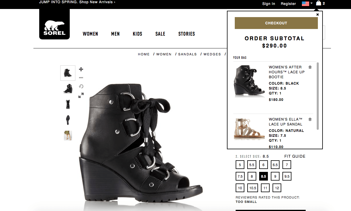
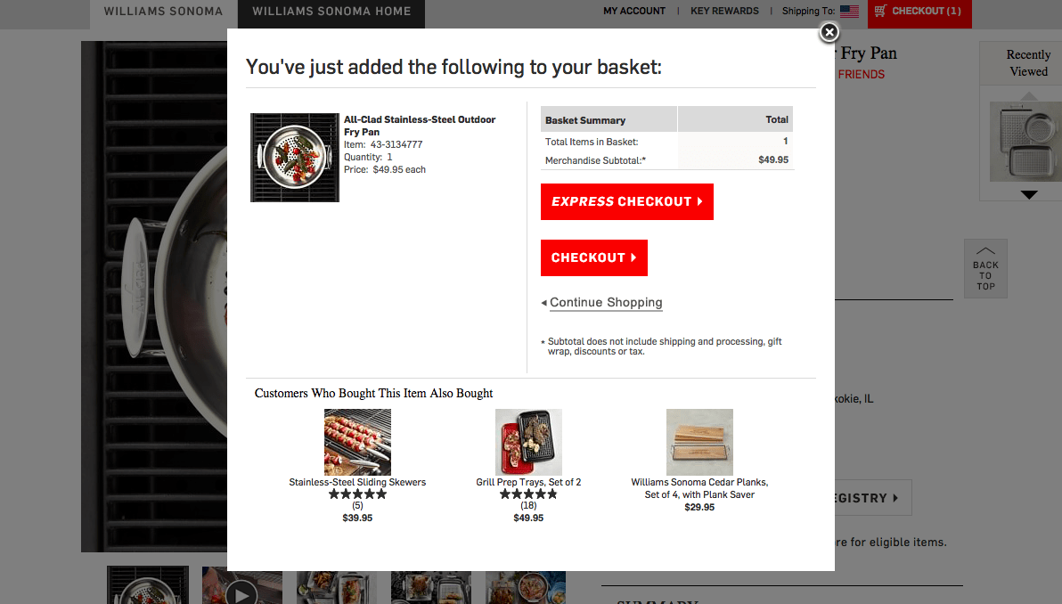
There are two standard styles you’ll see for sites that do this: a drop-down “bag” and a lightbox-style pop-in layer.
13 best-in-class sites use a drop-down “bag”.
9 best-in-class sites use a pop-in. We this option trending up and believe it’s because pop-ins allow for easier cross-selling options.
This year, we saw dramatic growth in the number of best-in-class sites that include product attributes (such as fabric, finish or size) in their cart details.
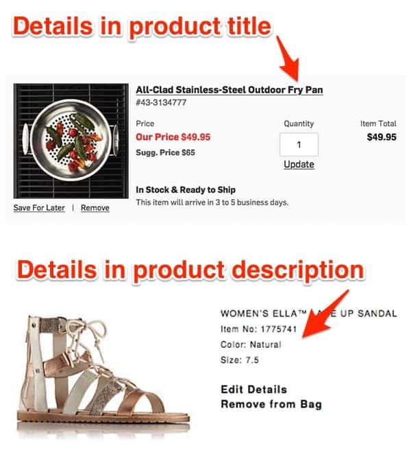
When you have similar products that may differ on one or more attribute, you need to show the attributes with the product name and picture to assure users that the right item is in their cart.
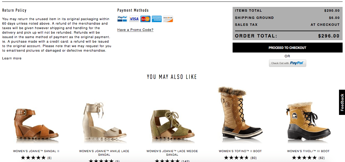
The “candy rack,” or upsell area is growing in popularity. You’ll currently find this in half of the best-in-class sites, and most of the sites that aren’t employing a candy rack simply haven’t found a good way of doing so.
For instance, due to the amount of products they sell, REI or Walmart need a higher level of intelligence to get the right product in front of you, and Nixon or GlassesUSA are unlikely to sell you another watch or frame. Whenever you can get relevant products in front of users, however, this has a high likelihood of increasing AOV.
Read Original Article at https://www.goinflow.com/
Each year we analyze leading eCommerce sites across dozens of categories to identify what features and technology they’re using: which features are trending and becoming the norm. In this post, we detail our research about shopping cart and checkout trends, creating the best checkout pages, and ecommerce shopping cart best practices, complete with examples from many of the websites we studied.
Based on our research on leading eCommerce sites in 2018, here are:
- Popular Shopping Cart and Checkout Features
- Shopping Cart and Checkout Features that are Trending Down
Part One: Popular Shopping Cart and Checkout Features
Across the leading eCommerce sites we studied, these six features were extremely common:Feature #1: Site Keeps a User on the Page When They Add an Item to the Cart
In use on 17 of 20 best-in-class websitesKeeping the user on the product page instead of taking them to a separate cart page is now a dominant trend in 2018.
Our rule-of-thumb is that sites that average more than 1.6 products per order should not send users to the cart each time they add a new product.
There are two standard styles you’ll see for sites that do this: a drop-down “bag” and a lightbox-style pop-in layer.
13 best-in-class sites use a drop-down “bag”.

9 best-in-class sites use a pop-in. We this option trending up and believe it’s because pop-ins allow for easier cross-selling options.

Feature #2: Cart Provides Product Attributes
In use on 18 of 19 best-in-class websites (1 site not applicable)This year, we saw dramatic growth in the number of best-in-class sites that include product attributes (such as fabric, finish or size) in their cart details.

When you have similar products that may differ on one or more attribute, you need to show the attributes with the product name and picture to assure users that the right item is in their cart.
Feature #3: Cart Contains a “Candy Rack”
In use on 10 of 19 best-in-class websites (1 site not applicable)The “candy rack,” or upsell area is growing in popularity. You’ll currently find this in half of the best-in-class sites, and most of the sites that aren’t employing a candy rack simply haven’t found a good way of doing so.
For instance, due to the amount of products they sell, REI or Walmart need a higher level of intelligence to get the right product in front of you, and Nixon or GlassesUSA are unlikely to sell you another watch or frame. Whenever you can get relevant products in front of users, however, this has a high likelihood of increasing AOV.

Read Original Article at https://www.goinflow.com/


No comments:
Post a Comment